Data Visualization Project using Power BI
Data Visualization Project using Power BI
Welcome to the GitHub repository for my Data Visualization project using Power BI! In this project, I have utilized Power BI to create compelling visualizations from raw datasets, enabling data-driven insights and informed decision-making. This repository contains the resources and documentation related to the project.
Project Overview
The primary goal of this project was to transform and visualize complex datasets to provide meaningful insights for better understanding and analysis. I employed various techniques and features offered by Power BI to achieve this, including Power Query for data cleaning and transformation, establishing relationships for data modeling, and utilizing DAX (Data Analysis Expressions) to create explicit measures for enhanced control and reusability.
Tasks Accomplished
-
Data Cleaning and Transformation using Power Query: I employed Power Query to clean and transform the raw datasets. This process involved handling missing values, standardizing data formats, and performing necessary data wrangling steps to ensure data accuracy and consistency.
-
Relationships for Data Modeling: To establish a robust and dynamic data model, I utilized Power BI’s relationship feature. By connecting relevant tables through appropriate keys, I created a foundation for generating coherent visualizations that draw insights from multiple data sources.
-
DAX Measures for Enhanced Control and Reusability: I harnessed the power of DAX to create explicit measures. These measures enable me to perform advanced calculations and aggregations while offering better control, reusability, and efficiency in connecting different components within the report.
-
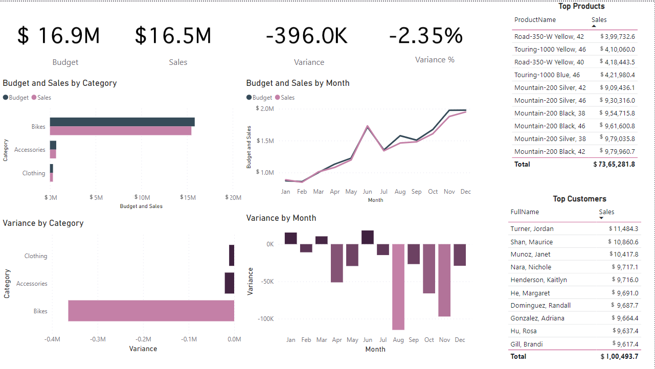
Creating Diverse Visualizations: This project encompasses a range of visualization techniques including cards, tables, and graphs. These visualizations have been carefully chosen to represent the data in a comprehensive and intuitive manner, facilitating easier interpretation and analysis.
-
Online Report and Dashboard Creation: After preparing the data and designing visualizations, I uploaded the Power BI report online. This allowed me to create an interactive dashboard that provides a seamless and user-friendly experience for exploring insights and trends within the data.
Feel free to reach out if you have any questions, suggestions, or feedback regarding this project. I hope these visualizations provide a clear understanding of the data and its implications.